Branding • website DESIGN
Balance in form.
Clarity in function.
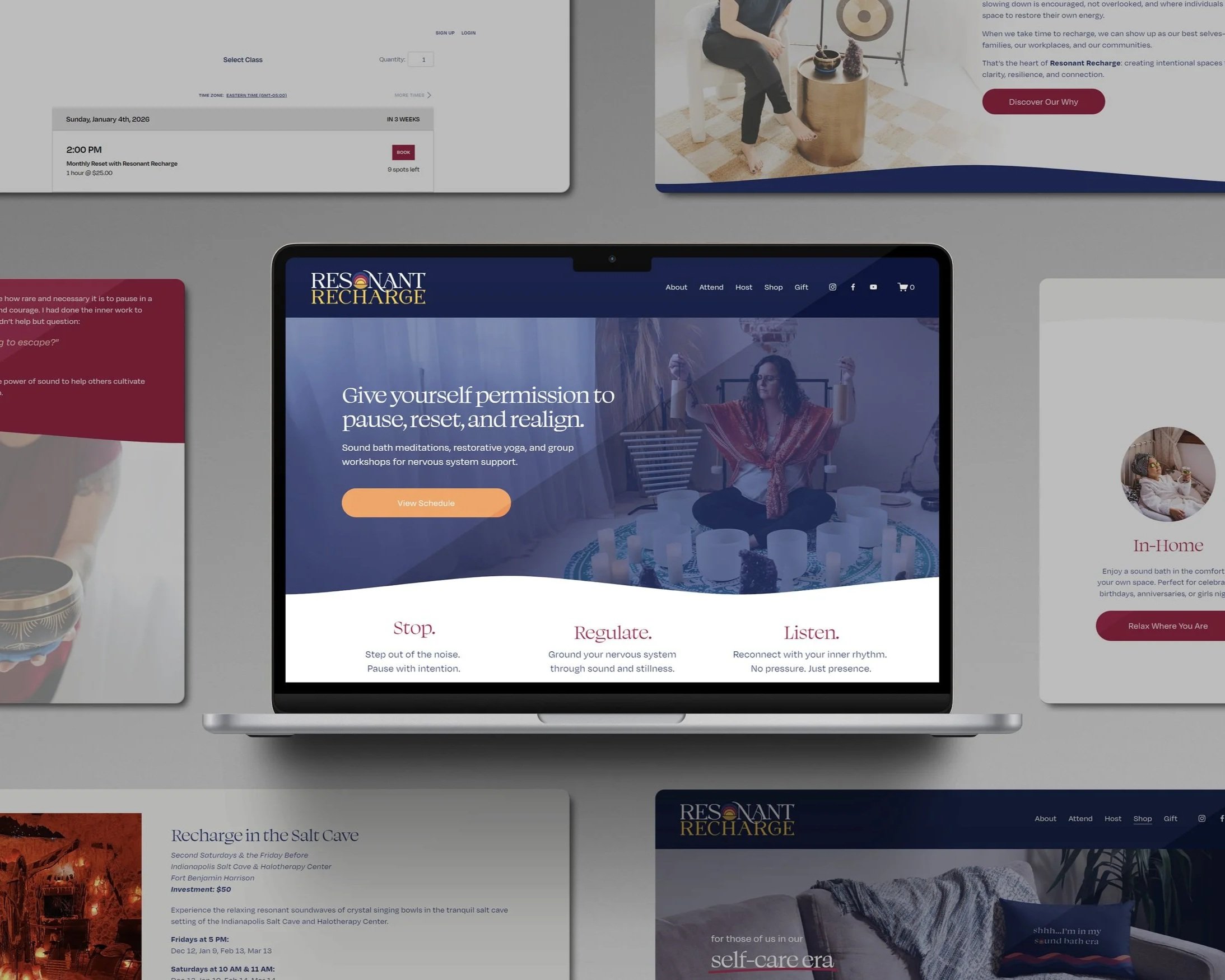
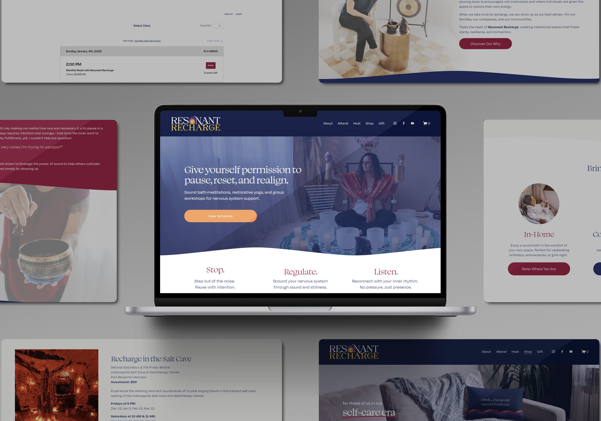
Resonant Recharge is my personal wellness and sound meditation brand designed to help people unplug, recharge, and reconnect. The branding and website needed to embody calm, clarity, and resonance, while visually reflecting the vibrational energy of sound bowls and the warmth of a sunset.
Crafting Calm.
Amplifying Energy.
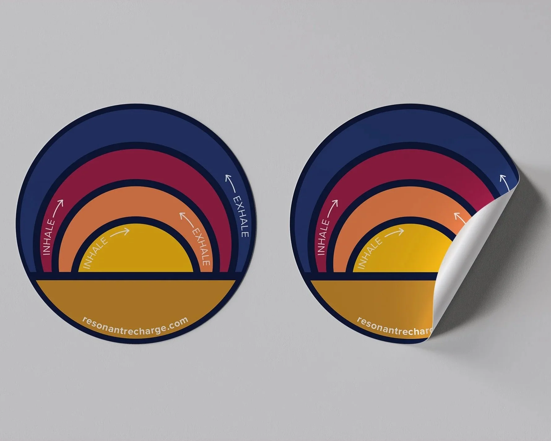
The logo draws inspiration from singing bowls, with sound waves radiating outward to form a shape reminiscent of a setting sun. It reflects the idea of recharging while balancing organic movement with gentle structure, resulting in a mark that feels grounded, intentional, and quietly memorable.
That same intention carries into the website experience. The layout is clean and intuitive, guiding visitors through offerings, events, and the story behind Resonant Recharge with ease. Thoughtful typography, calming color palettes, and spacious composition work together to create a digital space that mirrors the feeling of the sessions themselves.
Designing my own brand offered a unique opportunity to apply the same principles I bring to client work. The focus was on creating something that resonates not just visually, but experientially, capturing the warmth, energy, and clarity at the heart of Resonant Recharge.